You have a landing page, but does it attract as many leads as you want? Have you tried checking its effectiveness? We’ll show you an easy way to find out whether your landing page is understood by your users. It takes about 2 minutes, and doesn’t require any expensive A/B testing or research. All the tools are free and simple to use.
Interested? Then let’s go!In this article, we won’t detail the most common mistakes in landing page design. We’ll look at the main thing: whether your landing page is user-friendly and easy to understand.
I’ll show you how to test your landing page using our functional landing page as an example.
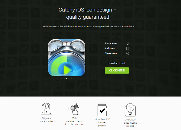
Here it is:

Test #1 How good is the text on your landing page?
The main idea: Remove everything from your page except the headers. If you can still easily understand what the site is about and what you want from the user, then the headers are correctly made.
How can you do it?
Here’s one of the easiest ways.
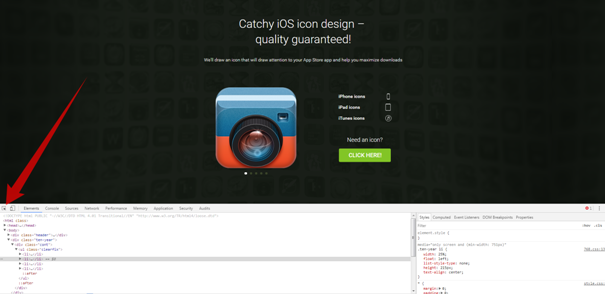
Enter the web inspector and remove all the pictures and unnecessary details.
To do this, right click on the “View code” button.
If you’re using the Chrome browser, find the item selection icon shown in the picture. Click it, then click on the item you want to remove.

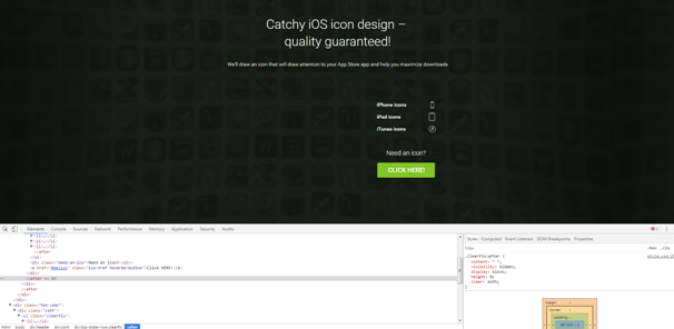
This is what our landing page looks after we delete the pictures:

Test # 2 Are the pictures on the landing page well chosen?
We’ve already told you how to choose the right pictures for your landing page. Now is the time to check how well you chose them.
The main idea: Translate the site into Chinese using the Google Translate or any other service you like. After you do this, if it’s still easy to tell what the site is about simply by looking at the pictures, then you’ve picked the right pics.
How can you do it?
The tool I like the most is http://en.opentran.net, but there are a lot of similar ones out there. You can use any one you like.
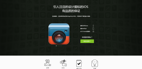
You have to specify the language you want to translate from, the language you want your text to be translated into, and insert your landing page’s URL. That’s it! Here’s the result:

http://translate.google.ru/translate?hl=zh-CN&sl=ru&u=http://www.icondesignlab.com/ru/ios-icons/— the sliding section with icons makes it easy to understand that these are examples of works.
Be sure to conduct these tests on your landing page! It won’t take more than 2 minutes, but you will quickly discover your mistakes (if you’ve made any). The tests will also be useful if you’re planning to create your own landing page.
Good luck – we hope you attract a lot of leads!
