Icon, image, thumbnail, symbol – these elements of a visual interface are known by many names. Why would we need them, how should we use them, and what do we have to know if we don’t want to confuse the user?
Icon design gave life to our studio back in 2005. That’s why we’re glad to share all the knowledge we’ve accumulated over the years with you.
Why use icons instead of words?
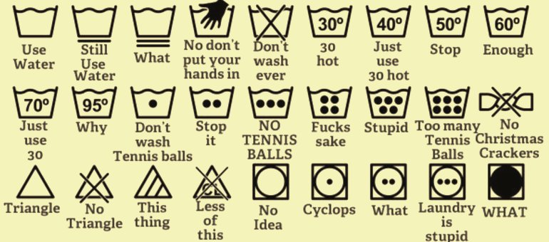
This issue is not only related to interface design. In everyday life, we are surrounded by icons: traffic signs along the road, signs at the entrance to any shop, even on clothing labels.
There are even T-shirts specifically designed for tourists to help them find a common language with local dwellers in any country. All they have to do is to simply point their finger at a relevant icon.

Why are we so fond of icons?
Because they offer a number of advantages:
• They catch the eye
• They send a message in an instant
• They are easy to remember
• They save space
• They are understandable in any language
User interface icons have some other advantages, as well:
• They are more pleasant to look at than huge blocks of text that could have been placed in the same spot. The smaller your screen, the more words you’ll want to replace with special icons.
• They can add to your application’s visual identity.
Yet the main thing that every icon should bear is DISTINCTIVENESS.
If the user does not understand the icon’s meaning, he or she will either avoid it or get confused.

To solve the problem of icon distinctiveness, do one of these things:
1. Explain the new icon’s meaning with some text, give hints, teach the user to use it correctly
This is the way you create a new user experience. The users should learn the interface symbols in the exact same way they used to learn their ABCs. If you want to use this method, you need to be confident in your product and the users’ willingness to learn how to use it.
Take Instagram, for example.
The paper-box icon was unclear to the user; only a few people understood that they were supposed to send private messages by clicking on it.

Currently, the private message icon has been replaced with a more comprehendible one:

So, let’s take a closer look at our second option.
2. Work to make a user interface icon that is distinct; create icons that are as user-friendly as possible
We’ll talk about the best ways to do this without going wrong.
Why don’t users always understand the icons in the interface?
Let’s look at some of the reasons why.
10 mistakes in interface icon design
1. Inaccurate icon image design

This is a pretty accurate example of an user interface icon that can’t be clearly understood and which may confuse the user as a result.
One old article about mistakes in icon design provides an example of a funny case when the data filter icon was created in a form of a funnel.

To avoid double interpretations, the designer should create an image with a meaning that can easily be understood. Don’t force the user to do the thinking.
2. Unclear connotation
Unlike the first reason, the form in this case is used correctly, but the user still can’t understand what this particular icon means and why it was used.
Take another look at the Instagram case, the one with the private message icon. You can easily catch the idea – this icon shows a box. But what do you associate a box with? Saving something? Inbox messages? Adding a new file? The hint is too subtle. The user has to think hard, and it means that picking this image was not a good choice.
Here’s another good example of how an interface icon design got me confused:

As it turned out, hovering a mouse over this icon brings out a pop-up hint:

However, I did not even read that hint, because my user experience told me the X was just a way to close the window.
An image of a trash can would have conveyed the idea of “delete the account” much more clearly. Moreover, this interface allows the use of text – and in this case, having the words “Delete your account” would be reasonable.
Here’s another example of a mismatch between the image on the icon and its meaning:

3. Icons that look alike
On one hand, user interface icons should match in style and look holistic and harmonious, unless you want something like this:

On the other hand, icons should be distinguishable from one another.
If you have two similar icons that are responsible for different functions, confusion can arise.

Here’s another example:

4. Not taking into account previous user experience
Do you remember how Viber had an arrow icon in a message-sending window?

A lot of new users got confused; they thought the arrow was supposed to send a message. Why did that happen? Before they started using Viber, a lot of people had used Skype and other messengers that had an arrow button for sending a message, and it was located in the exact same place.

An arrow in the Viber interface is used to send geolocation data. No wonder all of my friends were always aware of my location back in the day! 😉
Now the Viber interface looks different:

Therefore, you should carefully examine the interfaces of the main competitors before creating one of your own if you don’t want to confuse users or to force them to learn something different.
Creating a new user experience is a long and difficult way to go, and is often unreasonable.
5. Not taking into account the cultural characteristics of your target audience
Some user interface icons may be interpreted differently in different countries.
Just as certain hand gestures can be misinterpreted in some countries, some icons may be perceived dubiously as well.


If you want to create a universal app used all over the globe, try using more general icons.
I admit, there are not so many universally understood icons. You can name a few used at present time: a printer image (print), a house image (return to the main page), a magnifying glass (search) and that will probably be it. The hamburger menu icon may also become universal in the short run. However, some tests indicate that people are more used to seeing the word “Menu” rather than an icon showing three horizontally placed bars.
If your application is aimed at a certain audience in a particular country, consider their way of perception.
Thus, for example, the US residents are more used to having a shopping cart icon that indicates purchase (Source).

The United Kingdom residents are more familiar with a bag or a basket icon.

6. Wrong message
Interface icon design may influence user behavior.
Thus, when picking an icon for the “add item to your cart/basket” action, you should not consider the perception alone, but also its context.
The supermarket cart presumes that users can add more items at any time they like, but also that they can change their mind and put the goods back. In this case, you don’t push your prospective clients to buy, but subtly persuade them to make a purchase.
On the contrary, a bag has a stronger effect on the user’s mind. It urges him or her to actually buy something, not just put the goods into the cart. We are used to putting things into a bag after we’ve paid for them at the checkout desk, so this icon is more aggressively calling for a purchase.
Both kinds of icons can be used, and each one has pros and cons. You can add an item to your cart and forget about it, or you can leave the site without putting anything into your bag. Take the special features of your product into account and choose the right message.
7. Out-of-date images
You have to be careful here. Images can get old, exactly just like people do.

But will the new generation understand this image if they’ve never seen an actual floppy disk?

On one hand, replacing some of the now-popular icons will soon become a must. On the other hand, generations change much more slowly than our perception of particular things.
Let’s take an image of a telephone, for example:

The first icon is still relevant and understandable, even for new generations, because its shape is easily recognizable.
If you start using a smartphone image, you might confuse the user. Smartphones are associated with many other different functions apart from making phone calls.
Take a closer look at the “write new tweet” icon in the Twitter interface. It’s designed in the shape of a goose quill to convey the idea of “click here to start writing”.

A lot of icons use images that are out of date, but they still remain relevant, so consider all the risks of changing a well-known icon design to something new.
We no longer listen to music from cassette tapes or use old-fashioned microphones or TV sets with antennas; however, those images are better understood by the users than just a plain black rectangular smartphone that today can easily replace all these things.
8. Overloaded interface icon design
Don’t forget that your interface icon should be clearly understood not only when it’s large, but also at its minimal size.
That’s why all excess elements will make your interface look messy and confuse the user.
Just compare these images:

Nowadays this problem is less relevant than it was before flat and clear design became trendy. Flat icons are more easily perceived than complex 3D objects, and this is one of the reasons why they are so popular. However, a skilled designer can make even a three-dimensional icon clearly recognizable in any size.
9. Using text or not
To use text on icons, or not to use? Should you explain the meaning of an icon, or let the users figure it out themselves? There is no right or wrong answer to these questions.
Sometimes you need to convey such a complex concept that it would be impossible to understand it without some text or hints.
At the same time, if we get rid of all the icons and leave only text, we won’t be able to quickly focus on the right button.
If you have an opportunity to add text that does not overload the interface, it might be a good idea to do it.
As for the icon itself, you’d better avoid using the text in its design. In the smallest size, it may become unreadable and make the design look overloaded.
10. Scaling user interface icons
When you scale bitmap icons, they become fuzzy and blurry. That’s why a lot of designers prefer to create vector icons that won’t force them to waste time drawing all the small parts manually. Instead, they can simply scale the image up or down.
However, this approach is wrong, too.
Here’s an example of the user interface icon that was scaled down (zoomed in the red circle) and the same one manually re-drawn by a designer in a smaller size (zoomed in the green circle).

That’s why you should always ask the designer to draw the elements manually when creating different sizes.
Conclusion
Why did we decide to emphasize these 10 particular mistakes, and neglect some other, no less important ones? The reason is that these mistakes act upon the icon’s distinctiveness, cause confusion, puzzle the user and can affect the conversion.
As you can see from the examples given, a single poorly chosen user interface icon can force the user to delete his or her account, refuse to make a purchase or use an inconvenient application.
So, choose the right icons – or let experts do the job!