How to take advantage of holidays to increase sales

How to take advantage of holidays to increase sales

How can you make January your most successful sales month in 10 years? How, in the first 10 days of the quarter, can you sell more than you do in rest of the quarter? How can you make Halloween the best sales day of the year? Our answer: create holiday sales promotions. That’s what this article is about. You’ll learn whom to acknowledge, how to do it correctly, and what to give them as a present.

(more…)

How to choose a website prototyping service: 9 tools

Even masters make sketches and draw the details of large paintings on separate easels. If you need to create a high-quality website or a landing page, you have to choose a proper service to create a prototype. In this article, we present 9 of the most popular software applications that can help you create a website layout. We’ll also help you choose the proper tool.
In our previous post, we figured out what a landing page prototype is and why it’s needed. Today we’re going to consider some tools and software that can make further work on the project more user-friendly. We will also demonstrate the latest capabilities, the newest interfaces and compare prices.
Ok, let’s go! (more…)

how to build a landing page that converts: the ISDEF case

How to create a landing page that increases sales: the ISDEF case

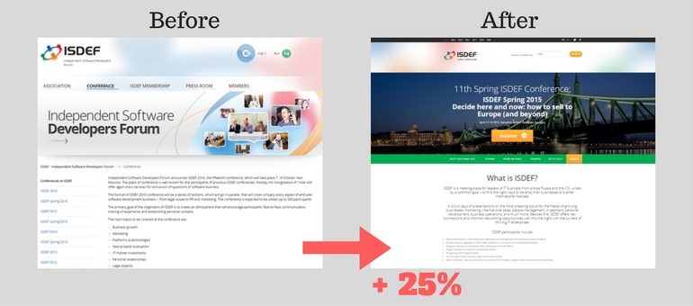
When turning to us, most customers want to improve the external appearance of their IT product. Many of them do not understand that only presenting beautiful graphics is not enough to generate leads and new customers. It’s better to solve the problem in a more complex way – to present the business in a new “package”. I will illustrate this idea through our client’s case. We helped him to increase sales by 25% and created a universal structure for a landing page, which became a reference for later landing pages. In this article, we want to tell you how to build a landing page that converts, about our deep immersion in the activities of the customer and solving his problem with the help of “business packaging”.

(more…)

18 tips from global brands on how to make the perfect Facebook cover

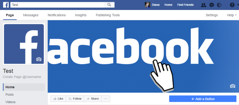
To succeed in anything, you need to look to the best. That’s why we checked out over 100 Facebook pages of well-known companies that have more than 1 million subscribers or likes – all this, just to find out which Facebook covers are the most effective. We arranged our results into 18 tips you can easily apply in your business’s Facebook page. You can also look at more than 50 vivid examples of Facebook page layouts for inspiration. (more…)

How can a new android app icon design affect the number of app downloads?

Case: How to increase application downloads by 14.2% using a new android app icon design

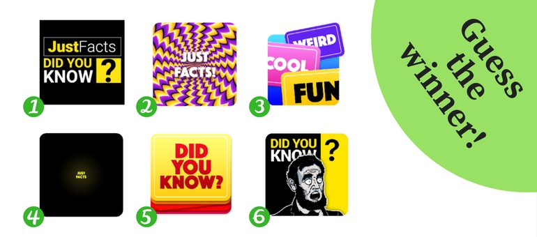
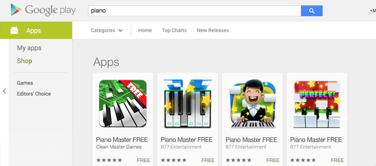
This is another case on how to increase application downloads using a new android app icon design and A/B testing on Google Play. During the experiment, we conducted 16 A/B tests, changed 6 design concepts, encountered an anomaly, and almost missed an important detail – but once again proved that a new icon design alone can increase an application’s organic downloads.

(more…)

5 common landing-page image mistakes

5 common landing-page image mistakes

Beautiful women always attract attention. Beautiful cars make passers-by turn and look. Beautifully packaged sells goods faster. Appearance is always the first thing to impress us.
And what kind of first impression does your landing page design leave? Did you know you have only a few seconds to capture a user’s attention before they move on to another site? On the Internet, pictures matter. If you don’t capture the user’s attention by the pictures on your site – he or she will close the tab.
However, there are 5 categories of images that will help you lose your customers faster than others. Check out these top-5 no-nos for choosing landing-page images – and try not to make the same mistakes. (more…)

10 landing page mistakes

10 mistakes in landing page design

Your landing-page design is your project’s highlight. It can give the user more information than any other words on the page. It’s like a girl’s make-up: if it’s neat and elegant, it looks up-market and beautiful; if you overuse the color or turn it into messy war paint, it seems cheap and frivolous.
But how can you create a wow-effect landing design, without overdoing it? Here are 10 common landing page mistakes, and 10 tips on how to fix them. (more…)

How to make your Facebook cover attract customers to your business page

How to make your Facebook cover attract customers to your business page

Your Facebook cover can be an excellent tool for attracting potential customers to your social network page. But what should the cover look like? What is the best Facebook cover size? What do you need to know about Facebook’s recent business-page redesign? We conducted a study, checked out hundreds of cover designs of world-famous brands and managed to answer all these questions. In this article, you’ll also find over 50 interesting Facebook covers to inspire you, 18 tips from global brands for your business-page design, and a couple of life hacks from our studio.

(This is the unchanged original version of the article that was written for Inspirationfeed) (more…)

100 easy-to-love iOS icons from around the world

It’s been over 10 years since the first iPhone appeared on the market. Users immediately appreciated its square ios app icon design with rounded corners. The icons were easy to click and gave a nice, neat orderliness to the screen. Only iOS icon designers were unhappy with the standard square icons – those square shapes limited the freedom for creative design. However, some experts decided to think out of the box. No squares would stop their creativity! In fact, the shape seemed to explode their creative thinking, and some true masterpieces began to appear in the AppStore.
This is the best ios app icon design collection we have gathered here for you. (more…)

How can an application’s icon design affect the number of app downloads?

How can an application’s icon design affect the number of app downloads?

How can you understand which app icon design will attract the most downloads? Even a professional designer with years of experience can’t answer this question with certainty. However, there’s a way to solve the problem: by ordering an app icon design that’s undergone A/B testing.
Roman Rudnik, the head of IconDesignLAB.com studio, wrote a column for SitePoint in which he describes his experiences in conducting A/B testing of a customer’s Google Play icon.
But they published a cut version, so we decided to publish the unchanged original in our blog, with some stunning and interesting details. Read it and you’ll find out how A/B testing works and how it helped us increase an application’s downloads by 34%. (more…)