10 examples of Contact Us page designs you'll want to imitate

10 examples of Contact Us page designs you’ll want to imitate

What do you usually see on a website contact page?
Phone numbers, emails, addresses, Skype numbers, information about representation, office photos, work schedules, travel maps, forms of treatment … Do you think this is enough? Look into your analytics and see how many people leave the Contact Us page every month without ever contacting you.
We hope these 10 examples will change the traditional view about Contact Us page design and how to keep users on it. (more…)

A Comprehensive Guide on How to Create an Effective CTA Button

A Comprehensive Guide on How to Create an Effective Call to Action Button

Did you know that just changing the color of the Call to Action (CTA) button can increase the conversion rate of a website by 35%? Is it worth placing a button above the fold line or at the bottom of the page? How do you change the text on the button to increase its efficiency by 68%?

We collected more than 10 interesting case studies and prepared a complete guide on how to create an effective Call to Action button to increase the conversion rate of your website. We will analyze what CTA buttons are and show how to place them correctly on your website, insert the necessary text and choose the most effective design.

(more…)

Sales Lead Forms: Choosing the Optimal Size According to the Research Results

Sales Lead Forms: Choosing the Optimal Size According to the Research Results

Lead Form (or Capture Form)  is one of the main parts of a website or landing page where the user can give his or her own personal information. It helps the user subscribe to newsletters or contact the company. Today, we show you how changing the size of a simple lead form can increase a website’s conversion rate by 120 – 240%.

If there are too many fields in a form, the user’s desire to fill them decreases. However, if there are only a few fields then you get less information about the user.

So how can you choose the optimal lead form size? (more…)

5 Free Useful Tools that can Help you with Website and SEO Analysis

5 free useful tools that can help you with website and SEO analysis

When a website doesn’t bring in the desired amount of users, the first thing to do, of course, is look for the reason why. In this article we’ve compiled a list of five online tools that will help you to make quick and effective website and SEO analysis, and you will learn how the key functions of these tools work.

This article will give you the online SEO tools that you can keep on hand when you need to quickly examine SEO-indicators, check download speeds, find your standing amongst competitors, make website analysis reports, and display it on various devices. (more…)

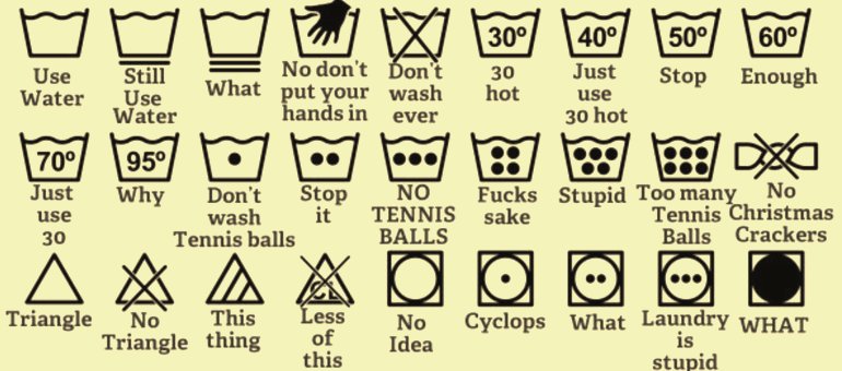
10 mistakes in icon design that confuse users

10 mistakes in interface icon design that confuse users

Icon, image, thumbnail, symbol – these elements of a visual interface are known by many names. Why would we need them, how should we use them, and what do we have to know if we don’t want to confuse the user? 

Icon design gave life to our studio back in 2005. That’s why we’re glad to share all the knowledge we’ve accumulated over the years with you.  (more…)

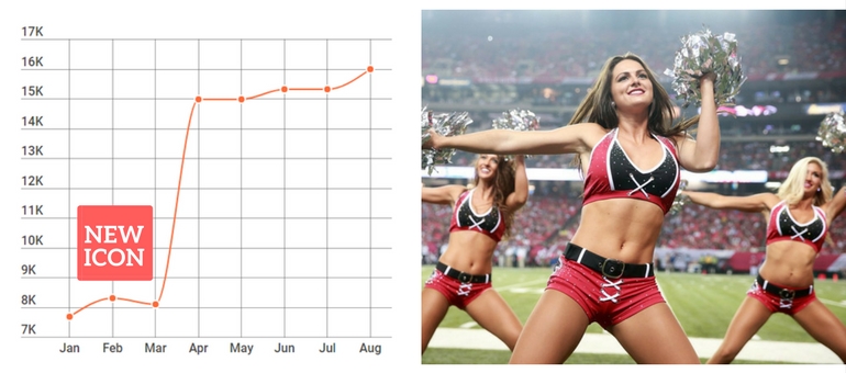
10 case studies that show how an application’s new icon increased downloads

10 case studies that show how an application’s new icon increased downloads

About 50% of users will try to find your application through a search engine. At the same time, 92.6% of people pay the most attention to visual factors when deciding to learn more about an app.
In fact, app icon design is the element that most influences a user’s desire to click on your app. You have doubts about it? Then check out these 10 cases that speak to the fact.
Let’s go! (more…)

20 ways to create a landing page without knowing how to code: a complete independent tool review

20 ways to create a landing page without knowing how to code: a complete independent tool review

It took me 44 hours to write this article. During this time, I studied and tested over 50 different tools for landing-page creation, and here I describe the best 20 in detail. So if you’re looking for the best way to create a landing page without knowing how to actually write code, you’ll definitely find a solution here.

(more…)

Two killer tests you should conduct before accepting a landing page

Two killer tests you should conduct before accepting a landing page

You have a landing page, but does it attract as many leads as you want? Have you tried checking its effectiveness? We’ll show you an easy way to find out whether your landing page is understood by your users. It takes about 2 minutes, and doesn’t require any expensive A/B testing or research. All the tools are free and simple to use.
Interested? Then let’s go! (more…)

How to identify your business’s strengths: 45 ideas for your landing page 

How to identify your business’s strengths: 45 ideas for your landing page 

Three shops were built next to each other.

The owner of the one on the left made a sign that read: “We have the lowest prices”.

The owner of the one on the right made a sign that read: “We have the best-quality products”.

The owner of the middle shop thought for some time, and then put up a sign with the words: “Main entrance here” above his door.

(an Internet joke)

We decide whether to enter a new shop or not by looking at its shop window. This is why the best products and decorations are displayed there, together with information about sales or discounts. Your landing page is a sort of a shop window for your business. It’s supposed to draw attention; it should describe your business in a brief and vivid way, and make the user click on the button you want to be clicked. However, a lot of business owners make a mistake by not highlighting the strong points of their business; moreover, they may not think those strong points even exist.  (more…)