20 ways to create a landing page without knowing how to code: a complete independent tool review

20 ways to create a landing page without knowing how to code: a complete independent tool review

It took me 44 hours to write this article. During this time, I studied and tested over 50 different tools for landing-page creation, and here I describe the best 20 in detail. So if you’re looking for the best way to create a landing page without knowing how to actually write code, you’ll definitely find a solution here.

(more…)

Two killer tests you should conduct before accepting a landing page

Two killer tests you should conduct before accepting a landing page

You have a landing page, but does it attract as many leads as you want? Have you tried checking its effectiveness? We’ll show you an easy way to find out whether your landing page is understood by your users. It takes about 2 minutes, and doesn’t require any expensive A/B testing or research. All the tools are free and simple to use.
Interested? Then let’s go! (more…)

how to build a landing page that converts: the ISDEF case

How to create a landing page that increases sales: the ISDEF case

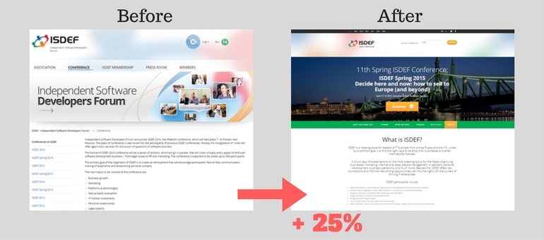
When turning to us, most customers want to improve the external appearance of their IT product. Many of them do not understand that only presenting beautiful graphics is not enough to generate leads and new customers. It’s better to solve the problem in a more complex way – to present the business in a new “package”. I will illustrate this idea through our client’s case. We helped him to increase sales by 25% and created a universal structure for a landing page, which became a reference for later landing pages. In this article, we want to tell you how to build a landing page that converts, about our deep immersion in the activities of the customer and solving his problem with the help of “business packaging”.

(more…)

5 common landing-page image mistakes

5 common landing-page image mistakes

Beautiful women always attract attention. Beautiful cars make passers-by turn and look. Beautifully packaged sells goods faster. Appearance is always the first thing to impress us.
And what kind of first impression does your landing page design leave? Did you know you have only a few seconds to capture a user’s attention before they move on to another site? On the Internet, pictures matter. If you don’t capture the user’s attention by the pictures on your site – he or she will close the tab.
However, there are 5 categories of images that will help you lose your customers faster than others. Check out these top-5 no-nos for choosing landing-page images – and try not to make the same mistakes. (more…)

10 landing page mistakes

10 mistakes in landing page design

Your landing-page design is your project’s highlight. It can give the user more information than any other words on the page. It’s like a girl’s make-up: if it’s neat and elegant, it looks up-market and beautiful; if you overuse the color or turn it into messy war paint, it seems cheap and frivolous.
But how can you create a wow-effect landing design, without overdoing it? Here are 10 common landing page mistakes, and 10 tips on how to fix them. (more…)