Case: How to increase application downloads by 14.2% using a new android app icon design
This is another case on how to increase application downloads using a new android app icon design and A/B testing on Google Play. During the experiment, we conducted 16 A/B tests, changed 6 design concepts, encountered an anomaly, and almost missed an important detail – but once again proved that a new icon design alone can increase an application’s organic downloads.
Information about the application and the customer’s problem
“Just Facts: Did You Know?” is an application that uses animated slides to tell you about amazing facts from different facets of science and the world.
Roughly 70% of the application’s users are men, mostly young.
Traffic is only organic, coming mainly from India, the USA, the Philippines, Pakistan and South Africa. In the Entertainment ratings, the application constantly jumped up and down.

Most users found the app by entering the keywords “did you know” or “facts”
Here’s what the application icon looked like before the developers contacted us:

Both keywords appear together in the original icon design
And this is how the icon used to look when situated among its competitors:

The most frequently used images are books, lightbulbs and all sorts of abstractions
The customer said that he had already tried to change the application icon. He conducted several experiments:

The first icon generated fewer downloads; the second one was tested on a similar app with quotes, but it did not meet expectations either
According to the customer, the icons failed because they were more abstract and did not convey what the application was about; however, the original icon contained the keywords in its design. We still had to check these assumptions, so we decided not to accept them as fact. Besides, the customer wanted us to create something entirely new.
The customer’s aims and wishes:
- Increase the number of application downloads;
- Test some entirely different concepts;
- Make the icon design colorful, three-dimensional and positive.
How we developed new android app icon design concepts
As requested by the customer, we decided to start with something completely new, totally different than what the icon used to look like.

Initial concepts and ideas
Simple designs to draw one’s attention:
– Sketches #1 and #2 have the app’s name spelled in larger letters, with a focus on the main key search requests.
– Sketch #3 has an icon style similar to TED, the scientific and educational channel. This is how we wanted to reach the US audience.
– Sketch #4 has a man sitting on the toilet and staring at his smartphone. It’s a bit shocking, but definitely attracts attention.
Entertainment-themed designs:
– Sketches #5, #6, #7 have some cards with the theme of facts or pictures dealing with different fields of knowledge, similar to the ones used in American quizzes or TV-shows.
– Sketch #8 has a letter F that stands for “Facts” and contains an infinite universe inside.
Designs with psychological tricks:
– Sketch #9 has a button that says “Don’t push it” – which makes you want to push it.
– Sketch #10 is a popular picture with a girl that looks like a lamp.
– Sketch #11 is an optical illusion that attracts attention. It should actually look like an animated icon.
– Sketch #12 has the app’s name written in tiny letters. This trick is aimed at attracting attention, because the user won’t be able to read it right away and will have to take a closer look.
Designs that show emotions:
– Sketch #13 has a stylized character showing surprise.
– Sketch #14 has a surprised alien.
– Sketch #15 has a man with his jaw dropped to the floor. We used the idiom to show someone’s great surprise.
– Sketch #16 has a surprised Einstein or some other well-known person.
– Sketch #17 has a more conventional character looking in the direction where the app’s name will be placed in the store. We use it to make the user pay attention to the app’s name.
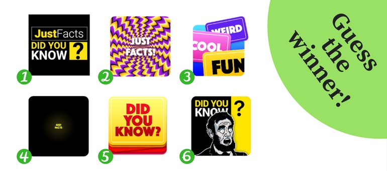
After our discussions with the customer, we chose 5 ideas. Each was later developed in several designs and color variants.
This is what we created before the A/B testing:

New concepts selected for A/B testing
Well, it turned out that everything was not as simple as we planned, and the test results were completely unexpected.
How we encountered difficulties during the A/B testing
The results of our first A/B testing were a bit discouraging. All the new icons had a worse result than the original one. In the settings for our A/B testing, the customer left the current icon with 25% of the traffic, and 75% were given for testing purposes.

Downloads went down
We conducted another round of A/B testing. This time, we gave 70% to the current icon and 10% to each new icon.
Again, the result was unexpected.

When we saw the app’s old icon, we thought: “We can easily draw a better one!” And here we have second test in a row showing that a high-quality visual graphic performed worse than the original icon
How we encountered an anomaly
When the downloads shrank after the first A/B testing, the customer didn’t want to risk anything more, so he allowed only 30% of the traffic for testing purposes. This made 10% per icon.
The reason is clear: there’s no need to give more traffic if Google scales the result.
Note: The so-called scaled installs we are targeting are the number of installs during the test period divided by the audience percentage. In other words, you distribute less traffic, but get the same result. However, we had some doubts.
For example, if you ran an experiment with two variants that used 90% / 10% audience shares and the installs for each variant were A = 900 and B = 200, the scaled installs would be shown as A = 1000 (900/.9) and B = 2000 (200/0.1).
We decided to conduct a so-called AAB test to check the anomaly. The point of the test is that we test a current icon together with the very same icon acting as a new one, plus a different icon.
We conducted several AAB tests, distributing the traffic in this way: 50% to the current icon, 25% to the current icon uploaded as a new option, and another 25% to the alternative option of a new design. It turned out that with 7-day testing and the traffic distribution of 25% for each alternative icon, the anomaly was -0.2 to 10.1% for 1.5-3K of loads.

According to Google, the test is finished and we can draw conclusions. The current icon beat its own twin variant and increased downloads by an average of 4.95%
This is what AAB tests are for. We found a dispiriting anomaly.
For your information:
The anomaly can become less, if:
- You increase the duration of testing
- The number of downloads is increased
- You assign more traffic to the test variant.
Even though we took into account the anomaly of 4.95%, the alternative icons still performed worse than the original one.
We knew that the anomaly would be less if the test was conducted for a longer time. When we have more than 3K downloads, the results is more accurate. However, we found no sense in waiting longer, since it was absolutely clear that the concepts we chose did not work.
Bingo! How we found a successful concept
Finally, we paid attention to a significant detail that we had basically disregarded before. Even though the customer wanted entirely new icon options, we came to the conclusion that it was not a good thing to do, and here’s why:
- The icon with text was much better at conveying the idea of the app. This was hard to admit, since having text on your icon is considered unacceptable throughout the world, with a few exceptions.
- The text on the original icon included the keywords that people used to find the app. Why would one take them away if they were exactly what users were searching for?
- Our designer paid attention to the fact that the Google search showed the old icon in the preview, while the search in the store already had the new one. So the user could get confused and close the tab.
When we started our work, the customer expressed some ideas that icons with text worked better than abstract ones. Now this idea seemed quite reasonable.
All of these observations made us think that it was better to re-imagine the old design rather than to create an entirely new one, since it could only confuse the users.
That’s how a new concept was born: to create a new icon based on the old design.
According to A/B testing, the icon that had a black-and-white image of surprised Abraham Lincoln appeared to be the best of the possible options. Also, the image fit perfectly into the old design.

Our task was to link the old design with a new image of a surprised Lincoln
That’s what came out of it:

The image of Lincoln integrated well, and we managed to keep the app recognizable and not lose the keywords used in users’ search queries
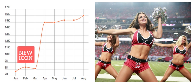
The latest test results were inspiring.

Finally, we decided to stop when the average conversion hit + 14.15%

Here it is, the winner icon
It was this particular icon that made the downloads during A/B testing grow by 6.2%-22.1%. Even taking into account the anomaly of 4.95%, we were happy with this result. We think we’ve done a good job if the average conversions grow by 10%. We achieved the result we needed, but, generally speaking, more tests could still be carried out.
Here are all the options we tested:

Unfortunately, we didn’t have an opportunity to try out many of these concepts
Probably, this is something like a path to perfection – a never-ending process.
However, the downloads of this app with our new icon design keep growing, and this what the app’s icon looks like today in Google Play.
Our conclusions on app icon testing
Each new A/B testing gives us new experience and important information we like to share with you. We’ve already told you about the case of how the word “Free” affected the amount of application downloads in a very unexpected way. This time we noticed a fact that goes against the generally accepted principle that having text on your icon is a no-no. Here’s a good example of how the text on the icon benefited the app and increased the number of downloads by 14.15%. So there’s no use in blindly following the rules simply to meet the traditional standards of icon design. Who knows – maybe your case will be an exception, too. It’s better to follow the rules proved by practical experience:
- The more clearly your icon conveys the idea of your app, the better it works.
- When choosing a design, it’s better to rely on A/B testing rather than on your opinion, trend lines or generally accepted rules.
- A completely new design, even one with a better graphic, does not guarantee you a large jump in conversions. Making little improvements in small steps is a surer way to your goal.
- Don’t rely blindly on A/B test results. Take into account the possible anomalies by using AAB testing and reduce the anomalies by changing the factors affecting it.
- Remember Google’s recommendations – the longer you conduct A/B testing, the more accurate the data.
And the main conclusion that can be drawn from this case is the following: an icon is a powerful tool that can significantly affect your application’s conversions.