How can you understand which app icon design will attract the most downloads? Even a professional designer with years of experience can’t answer this question with certainty. However, there’s a way to solve the problem: by ordering an app icon design that’s undergone A/B testing.
Roman Rudnik, the head of IconDesignLAB.com studio, wrote a column for SitePoint in which he describes his experiences in conducting A/B testing of a customer’s Google Play icon.
But they published a cut version, so we decided to publish the unchanged original in our blog, with some stunning and interesting details. Read it and you’ll find out how A/B testing works and how it helped us increase an application’s downloads by 34%.
To start with, take a closer look at these icons:

How it all started
“Piano Master 2” is an app where you press a piano key when a small brick falls over it. By doing this, you play a previously chosen melody. It seems like a game, but it can become useful to those who want to learn to play a real piano.
This app used to be unique, but now it has many rival applications. This is why our customer wanted to create a new icon – so the game could stand out among the other apps.

The customer filled out an application form, and we agreed to create three different unique Android app icons for Google Play A/B testing.
The customer’s wishes
The first icon had to be done in a more serious and classical manner – two-dimensional piano key notes, with note signs falling over them. The other icons were to be somewhat abstract, bright and dynamic. The customer sent us this image as a reference:

Also, the customer wanted to have stars on at least one of the icons (because you can see stars in the game when you play the piano).
A Work in Progress
Three days after we had received payment, we sent the customer these six drafts:
The customer liked icons 5, 4 and 1 (in order of priority). The only concern was the green color we took directly from the game; the customer asked us to make the green bar a little narrower.
After the customer’s minor remarks, the selected drafts began to look like this:
Now the customer was concerned about the word “Free” on one of the icons. The customer explained that there was no use for such a design. Previously, there had been two versions of the game: a paid one and a free one. Now only the free one remained, so there was no need to include the word “Free” in the design.
The design was approved, and here’s what we had after adding color to our drafts:

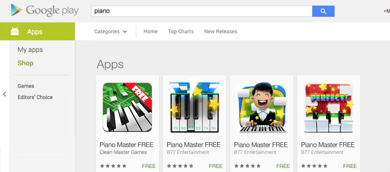
First Google Play A/B testing – choosing the best app icon design
Even before we began testing, we had certain concerns about whether it was fair to test the current icon with the word “Free” on it together with the new ones that had nothing written on them. The “Free” icon might mislead users into thinking that the other apps had to be paid for and cause them to not download it. We advised the customer to either remove the “Free” label from the old icon or to add it to the new ones to level the experimental playing field.

However, the customer didn’t take our arguments into account, so the only icon showing the word “Free” was the application’s former one.
Do you think this will affect the number of application’s downloads?
The results of our first Google Play A/B testing:

The winning icon increased the number of application downloads by up to 27.1% compared to its old version, even though there was nothing written on it.
However, we can’t say that this label does not affect the user’s choice: the second-best performer was the icon with the word “Free” on it.
Second Google Play A/B testing – choosing the best color option
Now the customer was no longer in doubt of which icon to choose. The only question was which color to go with.
For the next test, we chose the following icons:

As you can see, we couldn’t forget the magical impact that the word “free” was supposed to have, and neither could the customer. These concerns made the customer choose two blue icons for testing – one with the “Free” label, and one without it.

The only icon with a “Free” label appeared to be the least impactful!
Some interesting observations and conclusions:
• App icon design has been proven to impact the number of people wanting to download the app.
• The final version of icon increased the number of downloads by 9.6% – 34% more than the app’s old icon
• The version of icon that the customer liked the least appeared to be the most successful
• The difference in conversions between the worst icon and the best one was fourfold (for boundary cases). This means that if the customer had chosen the icon he liked, he could have ended up with four times fewer organic downloads that he got with the best one.
• The green color the customer wanted to get rid of became the winner among our three color options
• The word “free” had no magical impact on the number of application downloads
“Piano Master 2” still carries the icon we created. Interested in how well it gets the game’s message across? You can find it for yourself by following this link.
A/B testing is a great way to find out how effective an app icon design is and to help you choose the best color option. If you’re developing an Android app, you definitely need to use this technique.
The results of this case show how much design can affect the number of application downloads and a user’s decision to download a game. Draw your own conclusions and order Google Play A/B testing if you want your Android app icon design to have maximum effect!