How to make your Facebook cover attract customers to your business page
Your Facebook cover can be an excellent tool for attracting potential customers to your social network page. But what should the cover look like? What is the best Facebook cover size? What do you need to know about Facebook’s recent business-page redesign? We conducted a study, checked out hundreds of cover designs of world-famous brands and managed to answer all these questions. In this article, you’ll also find over 50 interesting Facebook covers to inspire you, 18 tips from global brands for your business-page design, and a couple of life hacks from our studio.
(This is the unchanged original version of the article that was written for Inspirationfeed)
What’s the right size for your Facebook cover?
In the summer of 2016, the design of business pages changed significantly, and so did the requirements. You can read about them in detail on the official help center page. We’re here to tell you about the most important things you need to know.

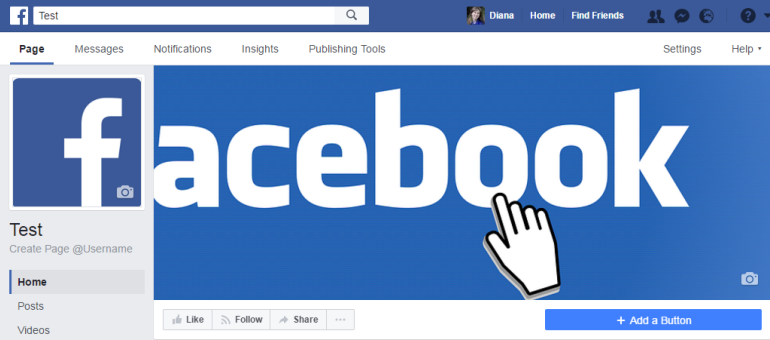
This is what the Facebook page design looks like at the time of writing (February 2017)
The square image on the left, or profile picture, is displayed with a resolution of 170 x 170 pixels on computer screens; 128 x 128 pixels on smartphones; and 36 x 36 pixels on multifunctional phones. You can edit the image directly on Facebook: crop it, scale it up or down, change color contrast and gradation, add stickers, frames or text.

On the left, you can find some tools that will help you edit your profile picture directly on Facebook
The Facebook cover photo is displayed at a resolution of 820 x 312 pixels on computer screens, and 640 x 360 pixels on smartphones. There is also a minimum requirement for image dimensions (399 x 150 pixels).
If you want all your pictures to look nice, make sure you upload them in a PNG format. You won’t be able to edit a cover photo directly on Facebook apart from moving it up or down. Therefore, you’ll have to make your own cover design beforehand or ask a professional designer to do it.
Please note that when a user hits the page, the buttons are on the top:

They overlap a small area of the cover picture.
When the user scrolls down the page, the buttons also move down.

Now, only the upper part of the cover picture is visible.
Useful tip: Do not put any essential information on the top of the picture.
Another feature of the cover design is that if you upload a picture of the specified size (820 x 312 pixels), only the central part of it will be visible on mobile devices.

This is how an 820 x 312 picture looks on a computer screen.
And this is the same picture on a smartphone screen.

Two zebras remain behind the scenes. Imagine: important news, or your company’s website address could have been there!
Useful tip: There are two ways to get out of this situation:
1) Place valuable information in the central part of the cover.
2) Be sure your picture is more than 312 pixels high.
For example, this is the mobile screen view of the same picture at 820 x 475 pixels.

All the zebras are in place, so all the information will be visible on the screen.
The main things you need to know about the latest changes in the Facebook pages design
After Facebook was redesigned in summer 2016, the layout of buttons and content changed. If previously you used any arrows to draw attention to certain elements, you will have to correct their direction.

An arrow draws attention to the free wallpapers.
And this is what the page looks like after the recent design.

Now the company uses a different trigger – a smiling woman placed in the right corner.
You also have an opportunity to add a large blue call-to-action button in the lower right corner. Therefore, if you wish to emphasize it, choose a Facebook cover design with the main elements located on the right.

The chocolate cookie on the right is placed above the button on the Oreo page.
Toyota decided not to use the call-to-action button. The page looks cleaner, and the buttons on the left are more noticeable.

The user’s attention is concentrated on the cover picture and the buttons on the left.
Here’s an example of how the blue button is used by Porsche.

On the Porsche company page, the blue button calls you to watch a video.
Whether or not to use the CTA button is up to you. Consider the benefits it may bring to your business. With this button, a user is only a click away from contacting you or watching a new product video. So why not use this marketing tool when it’s free?
Another notable change is that the profile picture has moved. It used to be in the bottom left corner of the cover photo, and some companies took advantage of it by integrating the cover element into the profile pic.

Here is a cover picture with an integrated element we made for a client.
After to the recent design, the profile picture is located to one side.

The cover looks clean now; the buttons, profile picture and profile name are located beyond the cover borders.
You can’t integrate images any more, but there’s more space on the cover, which will allow new scope for creativity.
Another recent update in a Facebook cover is a possibility of adding video to it as well as description and a button on the left. Videos must be between 20 – 90 seconds and at least 820 x 312 pixels. The recommended size is 820 x 462 pixels.

New changes in Facebook cover.

Example of using an extra button on the left by Macy`s
You never know what Facebook cover will look like tomorrow, so watch out for the latest changes with us.
Read the second part of the article to get 18 tips from world-famous brands on how to design your business page.
Let’s see how the world’s brands use their new Facebook covers now.
If you liked the article, subscribe to our blog or our Facebook page.