10 case studies that show how an application’s new icon increased downloads
About 50% of users will try to find your application through a search engine. At the same time, 92.6% of people pay the most attention to visual factors when deciding to learn more about an app.
In fact, app icon design is the element that most influences a user’s desire to click on your app. You have doubts about it? Then check out these 10 cases that speak to the fact.
Let’s go!
If your application doesn’t bring you as many downloads as you want, pay closer attention to what your icon looks like. Even though this is one of the ASO’s recommendations, the degree to which icon design affects the number of app downloads is still underestimated.
Here are 10 case studies from the global network to demonstrate visually, and in terms of numbers, what kind of results you can get by simply changing your main application icon design.
1. “Super Puzzle”: how to double the number of downloads
Per Haglund, who develops game apps for kids, set out to increase the number of downloads of his “Super Puzzle” game. He noticed that his other game, “Princess Memory”, was one of the best in its category by the number of clicks (click rate). It had a unicorn on its icon.
So he decided to change the “Super Puzzle” app’s icon and use the image of a unicorn there as well.
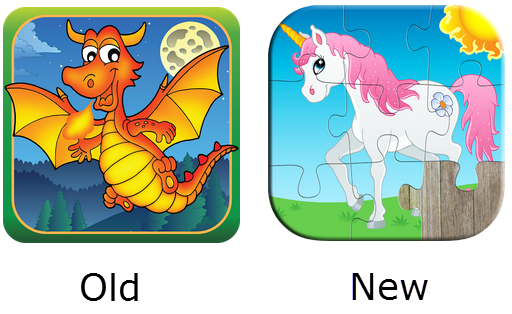
The icon’s old and new design
The result was amazing: the number of organic downloads doubled.
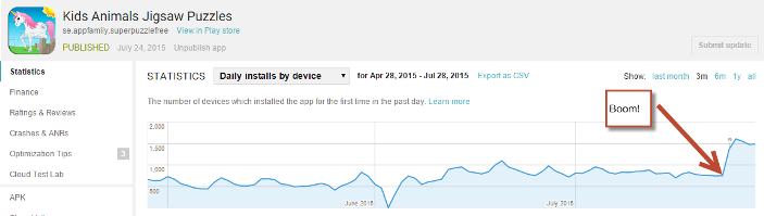
The arrow indicates the point when the icon design was changed
Later, Per discovered that 2/3 of the application users were women. Perhaps this is why this icon attracted more interest.
Then again, the new icon better captured the essence of the game, since it had puzzle pieces on it. So, to increase your downloads, do you only have to study your target audience and choose a new icon design that captures the essence of your app?
I wish everything was that simple. This case describes luck, rather than a predicted pattern; however, it still proves that icon design significantly affects the number of app’s downloads.
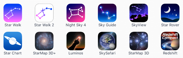
2. “Star Walk 2”: how to increase installs by 40%
The Vivo Technology, Inc. decided to change the icon for their “Star Walk 2” app after the conversion rates reached a low of 3% for the paid version and 30% for the free version.
After discussing various concepts, it was been decided to leave the Ursa Major image on the icon.
They conducted about 5 stages of testing
They conducted experiments with different color variants, and added a horizon and a flickering star, but the final test revealed this icon as the winner:
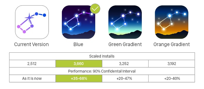
The final test results showed that the winning app icon design increased the number of application’s installs by 35-68% (not considering uncertainty) in comparison to the app’s previous icon.
3. CallApp: 20 application icon tests and +23% more installs
Liron Leshem is VP of Product at CallApp. He shared his observations after carrying out 20 different tests of his app’s icon.

This is what the icon looked like before testing
During the experiment, Liron tested various icon shapes, colors, backgrounds, added new elements and used 3D and 2D versions.
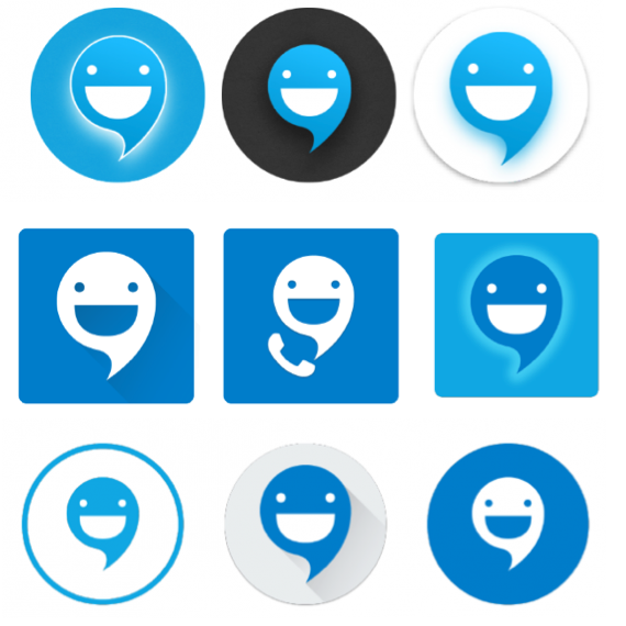
These are not all the options he tested
He never arrived at any definite conclusion about what works and what does not. However, he managed to determine a winning app icon design, and it increased his number of installs by 23.2%.
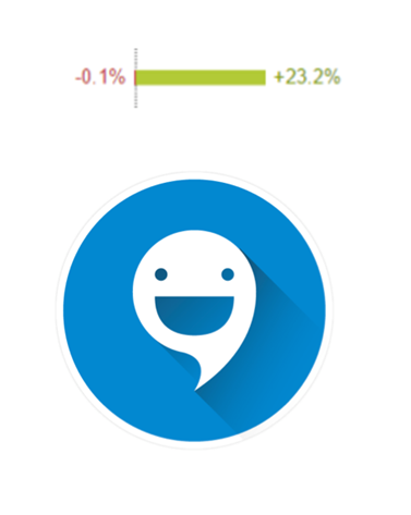
This is the icon Liron finally settled upon
Liron says he continues his experiments with the icon. Even when he gets good results, he never forgets that everything changes.
4. How Shay increased conversions by 44.1% with a new app icon design
The visual & digital designer Shay told us that when they were conducting A/B testing for the “EverythingMe Launcher” icon, everything had to remain confidential. His team was one of the companies Google chose to provide access to a brand-new (for the time being) tool for carrying out A/B testing on Google Play.
During the A/B testing, a lot of designs, different color options, shapes and styles, and even concepts that differed from the product and the brand were tested.
Some experiments were successful, although their success was somewhat unexpected; at the same time, some promising concepts fell short of expectations.
Shay said that notable changes for the better happened when the word “me” was removed from the icon.
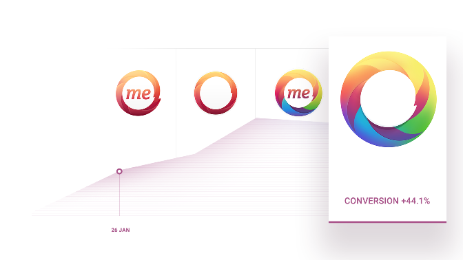
The final icon increased conversions by 44.1%
Shay believes that icons without words work better, because the app’s primary users were residents of Russia, Latin America and China. However, he says it’s possible that new trends, seasonal events and other factors could also have certain effects.
When asked what conclusions might be drawn from this A/B testing, Shay said the application icon design should be “words-less, plain and simple”.
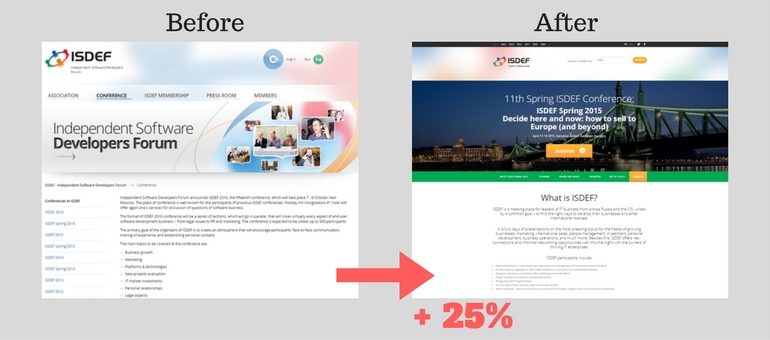
Also read: How to create a landing page that increases your sales: The ISDEF case
5. Two cases from Frenzoo: how to increase conversions using new icons
In the first case, the Frenzoo team decided to change their current icon for the “Island Resort” application and to check out several concepts: one had an image of a girl on a gameplay-based background; one with a girl wearing a hat; and another one with just a coconut and a drink.

A/B testing revealed that the girl’s face with no hat and a gameplay background was the best option, one that increased conversions up to 14%
In the second case, new app icon design concepts were tested for the older dress-up game, “Style Me Girl”. The previous concept of a girl holding a shoe competed with the following icons: a close-up shot of a girl’s face; a girl with a make-up brush and a clothes hanger in her hands; and an image of three girls standing against a brightly colored background.
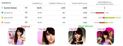
The third icon, the one with a girl blushing her face with a brush and holding a hanger, appeared to be the winner. It resulted in a 20.5 % increase in conversions.
Once again, we can conclude that the icon, which captures the essence of the game as closely as possible, works best.
6. CashQuizz: double the application downloads
Daniel Döberl and Philipp Wolschner, CashQuizz CEOs, had been testing different icon concepts and color variations for many weeks when they finally managed to double the number of organic daily downloads with the help of a new icon design and A/B testing.

The application’s old icon design and a new one
After some additional adjustments, they managed to increase the total number of application downloads by over 150%.
7. Tabtale: how to increase downloads by an average of 23.9%
Test results for the “Supermarket Girl” game icons showed that the second one was the clear leader; it managed to increase the number of downloads by 17.8-30%.
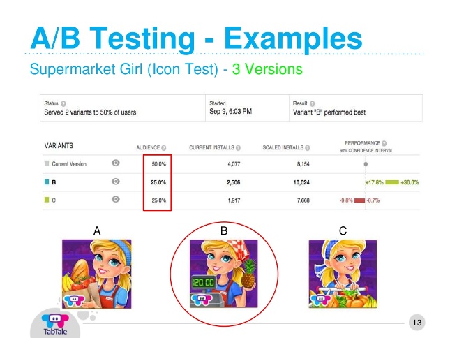
Icon A/B testing
8. Gram Games: a 26% increase in conversions
The Gram Games team chose these 5 variants of a new icon for their app. Try and guess the winning alternative:
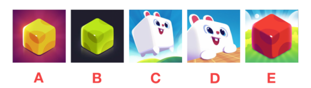
The A icon came out on top
A/B testing helped the team to increase the number of downloads by 26%.
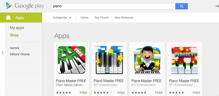
9. “Piano Master 2“: how to increase downloads by 34%
This is the case from our IconDesignLAB.com studio on how we created several app icons at the same time to conduct A/B testing and find out which icon would affect the number of downloads in the best possible way.
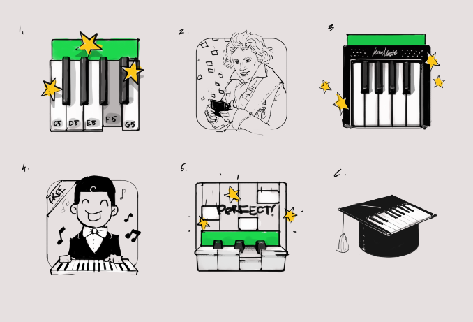
These are the concepts we offered to our customer for their application, which teaches users to play piano in a gamified form
As a result of our A/B testing, we discovered an application icon design that increased downloads by 9.6% – 34%.
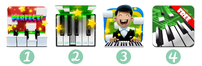
Try to guess which of these icons got the upper hand
You can find the answer in this article.
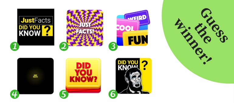
10. The “Just Facts: Did you know?” case: how to increase downloads by 14.15%
Here’s another case from our studio. It proves that having an icon with high-quality graphics will not necessarily guarantee you a huge increase in conversions. This case was not a walk in the park – we had to conduct 16 A/B tests and radically change several concepts, but eventually we managed to get a favorable result.
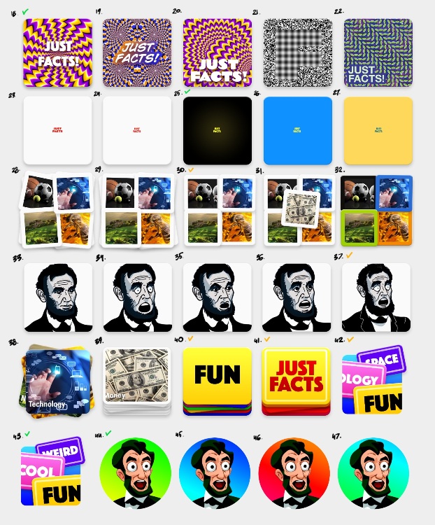
Concept variations halfway through the process of creating a new design
The app icon design that turned out to be the winner increased downloads during the A/B testing by 14.15%, – and it still keeps increasing application installs from the store.
You can read more about this case, the difficulties we faced while conducting the A/B testing, and the design anomalies and peculiarities that affect the conversion, and more, in this article.
What do these 10 cases tell us?
All these 10 cases beyond a doubt prove that an application’s icon design directly affects the app’s conversion rate. If you want to increase your number of installs, you can either leave it to chance by endlessly adding and subtracting different elements from your icon design, or radically change your concept. Yet, drawing on our experience in icon design, we can say that competent A/B testing of well-designed icon options still remains the best way to discover the design that works best.